Bona Terra Typeface
A text typeface for cookbooks.

Background
Bona Terra is an original text typeface I created during my time at Type West. The family consists of an italic and four roman weights: regular, medium, bold, and black. It is great for pleasant, long-form reading at a 10–12 point size in print or digital.
The design was made with my family in mind. After my grandmother passed away at the beginning of the pandemic, I ended up with boxes of her recipes. Since then, I have wanted to turn them into a cookbook for my family. I took this opportunity to create a typeface that I could use to showcase her delicious recipes. My goal was to make a pleasant and comfortable design that resembles the warmth and familiarity that I would experience at my grandparents’ house on Bona Terra Drive.


The Process
Bona Terra Regular was the first weight I created for my type family. It has a friendly look with elements like its rounded serifs and terminals that still allow for legibility at small text sizes. I hope to continue to work on this typeface in the future, and to expand the character set to include glyphs that would accommodate more languages.


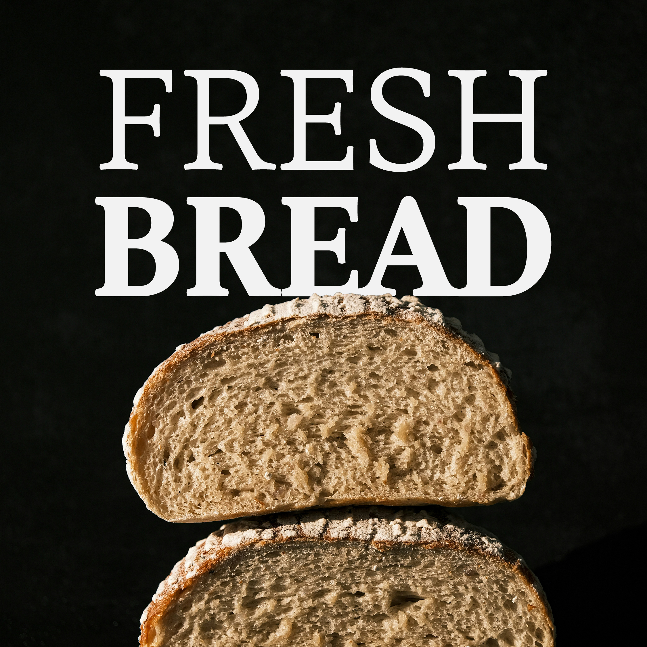
Results
The final result is an approachable and compelling text typeface perfect for any home cook or designer.


Other projects

