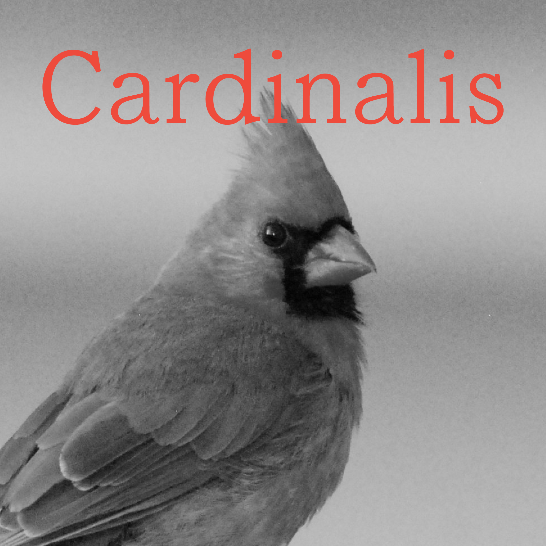
Bona Terra Display Typeface
A rootin' tootin' display typeface.

(01)
Background
Inspired by my other font, Bona Terra Regular, this design has a fun, display twist.


(02)
The Process
I wanted to take the serifs from the regular weight in Bona Terra and focus on enlarging and exaggerating them. By making the serifs bigger and the stems smaller, I ended up changing the font to a reverse contrast design with a horizontal stress.


(03)
Results
I have dubbed this design the “fun aunt” of the Bona Terra type family, not necessarily fitting in with her text type relatives, but sharing key features that keep those familial bonds.


No items found.
Other projects