Frankenstein
Cover and interior book design.

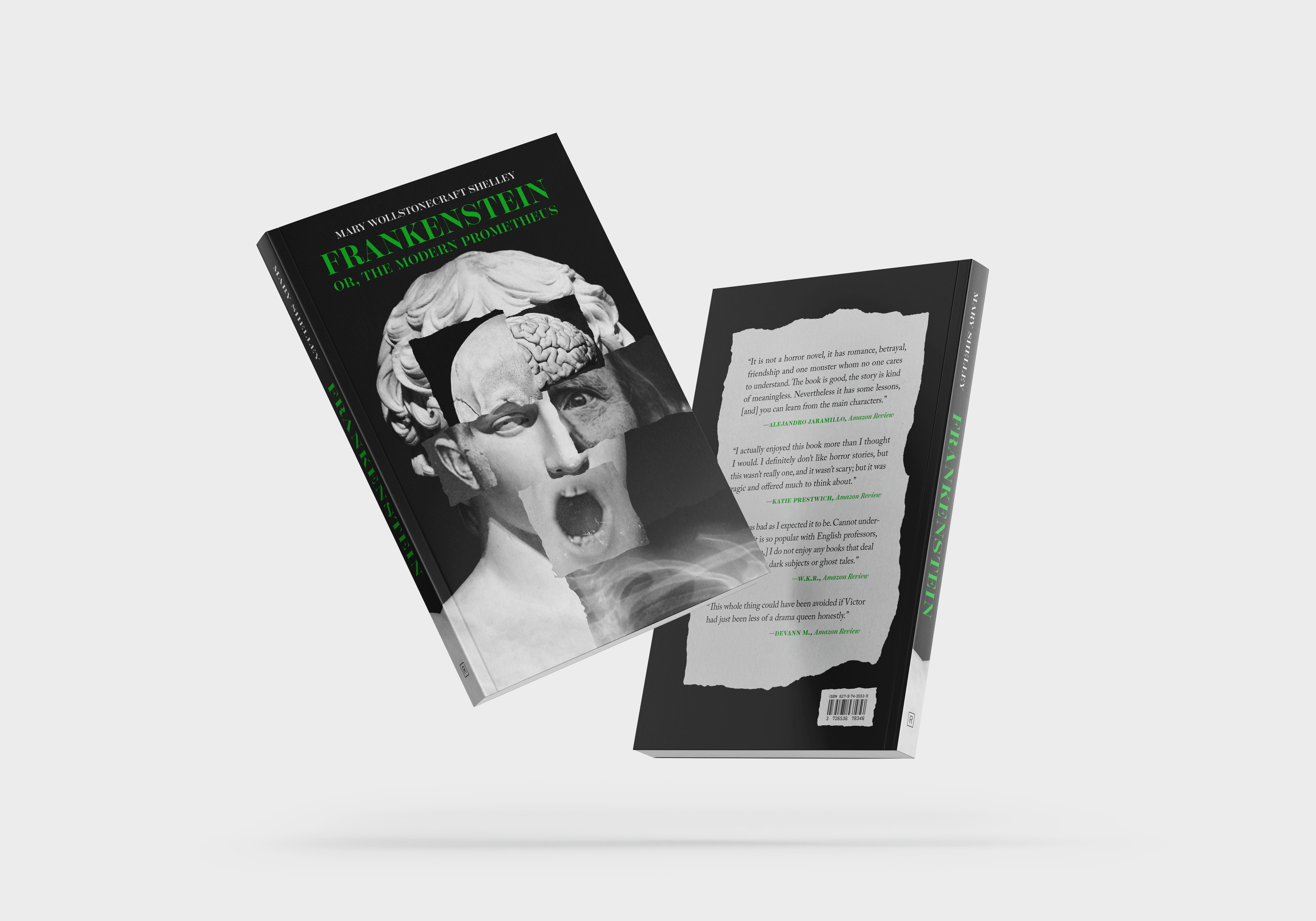
I remember reading Frankenstein when I was in high school, and though it was over a decade ago, I vividly recall the terrifying cover design of that book. For this project, I took this opportunity to create a cover and interior that would have sparked my interest when I was a student and I hoped to create a design that was just as impactful.


Project Details
Book: Frankenstein; or, The Modern Prometheus by Mary Shelley
Original Publication Date: 1818
Target Audience: High School Students
Trim Size: 5.5 x 8.5"
Text Type, Leading, and Measure: 11/15 Adobe Caslon Pro x 26p0
Display Type: Scotch Display
Specifications: French flaps, Spot gloss on the title and subtitle


My goal was to incorporate contemporary and traditional elements in my design. In the cover, I took inspiration from collages and the story of Victor piecing together his creation. This resulted in a more modern and abstract depiction of Frankenstein’s monster featured as the primary image. The imagery juxtaposes the type where I geared towards more historical typefaces. For the display type, I chose Scotch Display which is similar to the display typeface used on the pages of the original 1818 published specimens. Then I typeset the interior of my book in Caslon, which would have been an available choice in England around the time the book was released.


Other projects

